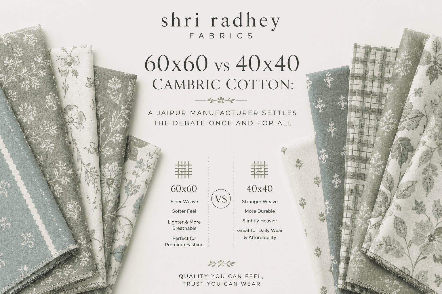
This question lands in our inbox at least three times a week.
“What is the difference between 60×60 and 40×40 cambric?”
Sometimes it comes from a first-time fashion brand founder who has received two price quotes and cannot figure out why the same fabric name costs different amounts. Sometimes it comes from an experienced wholesale buyer who knows what they want but cannot find a clear explanation online. And sometimes it comes from a boutique owner in Jaipur’s fabric lanes who has been told by two different vendors that their fabric is “the better one” — without being told why.
It is a genuinely good question. And the honest answer is not as simple as “one is better than the other” — because the right choice between 60×60 and 40×40 cambric cotton depends entirely on what you are making, who you are making it for, and how you are positioning your brand.
This article gives you the complete answer. Written from our manufacturing floor in Sanganer — where we work with both specifications every single day, in block printing, screen printing, and plain fabric supply — this is the clearest comparison of 60×60 and 40×40 cambric cotton available anywhere.
Start Here: What Do the Numbers Actually Mean?
Before we compare the two fabrics, you need to understand what the numbers represent. This is the part that most people get confused about because the terminology feels more complicated than it actually is.
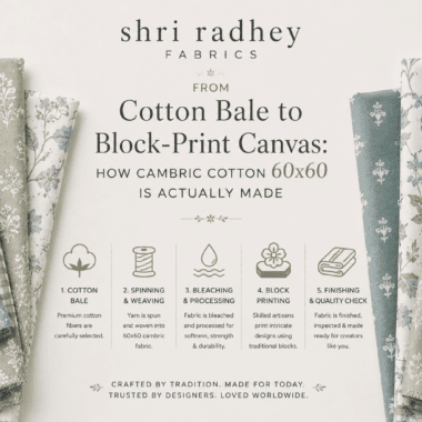
Both “60×60” and “40×40” refer to yarn count — specifically, the fineness of the yarn used to weave the fabric. The count is measured using the English Ne (Number English) system, which is the standard across India’s cotton textile industry.
In simple terms: the higher the Ne count number, the finer and thinner the yarn. A 60-count yarn (written Ne 60 or 60s) is finer than a 40-count yarn (Ne 40 or 40s). The yarn is spun from longer cotton fibres under more controlled tension to achieve the finer specification.
When a fabric is called “60×60,” it means both the warp threads (running lengthwise along the fabric) and the weft threads (running crosswise) are made from 60-count fine yarn.
When a fabric is called “40×40,” it means both directions use 40-count yarn — coarser, with thicker individual threads.
This single difference — 60s vs 40s yarn — is the root cause of every other difference between these two fabrics. The hand feel, the surface texture, the print quality, the GSM, the drape, the price — everything flows from those two numbers.
How They Actually Feel: The Touch Test
If you put a piece of 60×60 cambric and a piece of 40×40 cambric side by side on a table and run your hand across them, you will notice the difference immediately — even if nobody has told you which is which.
60×60 cambric feels smooth. Not silky-smooth like a satin, but smooth in the way a clean, well-pressed cotton shirt feels. There is almost no surface texture. The calendering process — where heated rollers press the fabric under high pressure — enhances this smoothness further. The surface has a subtle, quiet sheen. When you scrunch it lightly, it crinkles with a slight crispness, like a freshly ironed cotton handkerchief.
40×40 cambric feels different. You can feel the fabric more — there is a gentle graininess to the surface, a slight texture under your fingertips. It is not rough, and it is not unpleasant. If anything, many buyers describe it as feeling more natural, more tactile, more like what they imagine when they think of “Indian cotton.” The individual threads are thicker, and at 40×40 construction they are spaced slightly more openly, which gives the fabric a character that 60×60 does not have.
This textural difference is not a quality defect in 40×40. It is simply the inherent character of a coarser-count yarn in a plain weave. In fact, for certain brand aesthetics — earthy, artisanal, handloom-adjacent, Bagru block-print style — the visible texture of 40×40 is precisely what makes it the better choice.
The Technical Specifications Side by Side
| Specification | 60×60 Cambric | 40×40 Cambric |
|---|---|---|
| Yarn count (warp x weft) | 60s x 60s | 40s x 40s |
| Thread construction (EPI x PPI) | 92 x 88 | 60 x 60 |
| GSM range | 75 – 95 GSM | 100 – 120 GSM |
| Surface texture | Smooth, slight sheen | Visible grain, natural texture |
| Finish | Calendered | Soft-finished or lightly calendered |
| Weave density | Dense — tight, close weave | More open — visible weave structure |
| Fabric weight feel | Light but substantial | Slightly heavier, more body |
| Drape | Crisp, structured drape | Softer, slightly fuller drape |
| Opacity | Good opacity at 90 GSM | Good opacity at 110 GSM |
| Typical width | 44–45 inches | 44–48 inches |
| Yarn character | Fine, even, combed | Medium, slightly textured |
| Price point (per metre) | Higher — typically 15–25% more | More economical |
What Happens When You Print on Each
This is where the difference between these two fabrics matters most for Jaipur’s block-print and screen-print community — and it is the section that most buyers are not told about clearly.
Block printing on 60×60 cambric produces what most people picture when they imagine a classic Sanganeri block print. The tight, smooth surface holds the block’s impression cleanly. When a wooden block carved with a fine floral motif is pressed onto 60×60 cambric with dye paste, the result is sharp, defined edges with excellent colour clarity. Fine-line designs — delicate paisleys, intricate botanical motifs, geometric lattice work — print with clarity because the tight weave prevents the paste from bleeding beyond the block’s contact area.
The print sits on a clean, white or off-white background that seems to make the printed colours glow. This is a visual effect of the bright, bleached, calendered surface contrasting with the print — something 60×60’s smooth surface delivers better than any other base fabric.
Block printing on 40×40 cambric gives you something different — and something that a specific type of buyer actively seeks out and pays for. Because the threads are thicker and the weave slightly more open, the block does not contact every thread uniformly across its face. There are micro-variations in how the dye paste deposits onto the fabric. Fine-line details in a design have slightly softer edges. Bold, geometric, or large-motif designs read clearly but with a warmth and depth that 60×60 cannot replicate.
Many buyers who work with Bagru dabu prints, natural dye block prints, and artisan-positioned collections specifically prefer 40×40 for exactly this reason. The slight softness of the print impression — the fractional irregularity of how colour sits on a textured surface — makes the finished piece look more handmade, more honestly crafted, less machine-perfect. When the brand story is authenticity and artisan heritage, the 40×40 surface communicates that story without any marketing copy needing to say it.
This is not a defect. It is a design choice.
Screen printing on 60×60 gives sharp, commercially clean results ideal for high-volume production of printed dress material. The smooth surface and consistent weave density allow screen-print paste to deposit evenly with excellent edge definition.
Screen printing on 40×40 works well for bold designs and geometric prints but may show slightly softer edges on fine-detail designs. For brands using large motifs, animal prints, or bold colour-block designs, the difference is minimal. For brands using intricate micro-patterns, 60×60 is the better base.
Digital printing works well on both. However, the smooth surface of 60×60 cambric shows photographic-quality digital prints at their clearest, while 40×40’s slight texture can give digital prints a more tactile, “hand-printed” visual character that some buyers prefer.
The GSM Difference: Lighter vs. Weightier
60×60 cambric typically falls between 75–95 GSM. 40×40 cambric typically sits between 100–120 GSM. This 20–25 GSM difference is meaningful in practice, and understanding it prevents surprises when your fabric arrives.
For summer collections and hot-climate wear: 60×60 cambric’s lower GSM means the garment feels lighter against skin. In Rajasthan’s heat — where temperatures regularly cross 40°C — the difference between a 90 GSM kurta and a 110 GSM kurta is very perceptible. Both are comfortable by global standards, but 60×60 edges ahead on pure summer lightness.
For structure and body: 40×40’s slightly higher GSM gives the fabric more substance. Kurtis made from 40×40 hold their shape a bit more confidently when worn untucked. They drape in fuller, slightly softer folds rather than the crisper drape of 60×60. For certain silhouettes — A-line kurtis, flared hem styles, palazzo sets — this fuller drape is actually the better choice.
For home textiles: When making printed fabric for cushion covers, table runners, or decorative napkins — where the fabric needs to sit flat and hold its structure — 40×40’s slightly higher GSM gives better results. 60×60 at 85 GSM can feel a little light for home textile applications.
The Price Reality: What You Are Actually Paying For
Let’s address the commercial question directly because it comes up in every sourcing conversation.
60×60 cambric costs approximately 15–25% more per metre than 40×40 cambric at comparable construction quality. In absolute terms in the Jaipur wholesale market:
- Quality 40×40 cambric: typically ₹45–₹70 per metre (unprinted greige or bleached)
- Quality 60×60 cambric: typically ₹60–₹90 per metre (unprinted greige or bleached)
Printed prices vary by design complexity, printing technique, and order volume.
What are you paying for in the 60×60 premium?
You are paying for finer yarn — which requires longer-staple cotton and more controlled spinning. You are paying for the additional weaving precision that a finer yarn at denser construction demands. You are paying for the calendering process that gives the surface its characteristic smoothness. And you are paying for the print-quality difference that the tighter weave delivers.
Whether that premium is justified depends on your product positioning. For a brand selling block-print kurtis at ₹1,200–₹2,000 retail, the 60×60 premium adds perhaps ₹30–₹50 to your fabric cost per garment but allows you to price the finished product at the higher end of your range with confidence. For a brand building volume at ₹600–₹900 retail, 40×40 cambric gives you an excellent quality product at a cost structure that supports your margins.
Which Brand Belongs to Which Fabric?
Here is a practical framework for making the choice. Based on our experience working with hundreds of fashion brands from our Sanganer manufacturing unit:
Choose 60×60 cambric if:
Your brand is positioned at the premium or upper-mid range of the market. Your designs use fine-line motifs, intricate geometrics, delicate florals, or any pattern where sharp print definition is central to the design’s appeal. Your target customer is someone who notices and appreciates fabric quality — who picks up a kurta and feels whether it is good or not before they look at the price tag. You are selling in the UK, UAE, European, or Japanese export market, where buyers have high expectations for fabric refinement. You are building a label around Sanganeri block-print tradition — the fine, precise, white-ground floral prints that Sanganer’s artisans are famous for.
Choose 40×40 cambric if:
Your brand is volume-focused or positioned at the accessible price point where margins are tighter and cost control matters without sacrificing quality. Your designs feature bold motifs, large geometric patterns, Bagru-style earthy prints, or any aesthetic where the fabric’s natural texture adds to the look rather than competing with it. You are making garments for everyday wear where comfort and durability are more important than surface refinement. Your brand story is rooted in craft authenticity, handloom character, and artisan aesthetics — the slight warmth and imperfection of 40×40 serves this narrative better than 60×60’s machine-polished surface. You are producing home textiles, co-ords for casual wear, or nightwear — where GSM and comfort matter more than surface smoothness.
Choose both if:
You are building a layered collection with multiple price points. Many of our established brand clients use 60×60 cambric for their signature collection and hero pieces, and 40×40 cambric for their volume styles and everyday range. This gives their collection a clear quality gradient that customers can see and feel — which supports premium pricing on the 60×60 pieces without making the 40×40 pieces feel like a compromise.
A Common Mistake to Avoid
Here is something that happens more often than it should in sourcing conversations, and it causes real commercial problems.
A buyer orders a sample in 60×60 cambric, approves the quality and the print, then asks for the bulk order to be produced at a lower price. The manufacturer switches to 40×40 cambric to hit the lower price point — but does not clearly communicate this to the buyer. The bulk delivery arrives. The buyer notices something feels different but cannot immediately identify what. They launch the product. Customer feedback starts mentioning that the fabric feels slightly heavier, slightly less smooth than their expectations. Returns increase on online orders where customers cannot feel the fabric before buying.
The fabric is not defective. It is simply a different specification. But the buyer did not know they were buying a different specification.
The way to protect yourself from this is simple: always confirm in writing, before bulk production, whether your order is 60×60 or 40×40 — and ask for the GSM certificate that confirms the fabric received matches what was agreed. These two data points — yarn count and GSM — will immediately flag any specification substitution.
The 40×60 Hybrid: What Is It and When Does It Appear?
You may occasionally encounter a third specification written as “40×60 cambric” — 40-count yarn in the warp and 60-count yarn in the weft, or vice versa. This asymmetric construction produces a fabric that sits between the two standards in most characteristics.
40×60 cambric has more texture in one direction (the 40-count direction) than the other. It is slightly lighter than pure 40×40 but not as smooth as pure 60×60. It is sometimes used as a cost-saving middle ground — delivering better surface quality than 40×40 at lower cost than 60×60.
For most brand applications, we recommend sticking with the balanced specifications — 60×60 or 40×40 — rather than asymmetric constructions, because the balanced weave gives more consistent print quality and a more predictable hand feel across the full fabric width.
The Print Colour Difference: Does the Base Fabric Affect Colour Vibrancy?
Yes — and this is a detail that buyers rarely factor into their specification decision until they have seen both side by side.
On 60×60 cambric, printed colours appear brighter and more saturated. The highly bleached, smooth white surface reflects more light, which makes coloured motifs appear more vivid against the background. Deep blues look deeper, reds look brighter, and fine-line designs in white reserve on coloured grounds look cleaner.
On 40×40 cambric, the slightly more textured and often slightly less brilliantly white ground absorbs light differently. Colours appear slightly warmer and earthier — particularly significant for natural-dye and Bagru-style block prints, where this quality is exactly the right one. The earthy madder reds and natural indigo blues of Bagru printing look more authentic, more grounded, on a 40×40 surface than they would on the clinical brightness of bleached 60×60.
Again — this is not better or worse. It is a different visual outcome. And knowing which outcome your brand needs is the key to choosing the right specification.
Sustainability Perspective: Does the Count Difference Matter for Eco-Credentials?
Both 60×60 and 40×40 cambric cotton are 100% natural fibre fabrics. Both are biodegradable, breathable, and free of synthetic polymers. Neither has a sustainability advantage over the other in terms of fibre content.
Where the difference lies is in production resource use. 60-count yarn requires more processing energy in spinning — finer yarn demands more spinning passes, more controlled tension, and longer fibre to achieve the count without breakage. The calendering process adds an additional energy-intensive step. In absolute terms, 60×60 cambric has a slightly higher production energy footprint per metre than 40×40.
However, for brand sustainability credentials, what matters most to international buyers in 2026 is fibre certification (OEKO-TEX, GOTS), dye certification (AZO-free), and production transparency — not which cambric specification was used. Both specifications can be sourced with full sustainability documentation. Both can carry OEKO-TEX Standard 100 certification. Both are equally compatible with natural dyes and AZO-free reactive dyes.
Our Recommendation at Shri Radhey Fabrics
After working with both specifications across thousands of garment production runs and fabric supply orders, here is the framework our own team uses when advising new brand clients:
Start with 60×60 cambric if you are building your brand’s flagship product and you want the best base for block-print or screen-print quality. The premium is real but the difference in customer perception is also real.
Move to 40×40 cambric when you are scaling into volume styles, building accessible price-point collections, or making garments where the artisanal texture of a natural-grain cotton surface serves your aesthetic better than clinical smoothness.
Use both deliberately — not because you cannot decide, but because a collection that uses 60×60 for signature pieces and 40×40 for everyday styles creates a quality gradient that supports tiered pricing and gives customers a reason to trade up.
Both fabrics are available from our manufacturing unit in Sanganer, Jaipur — in greige, bleached, dyed, and custom-printed form. We supply in low MOQ for new brands and full rolls for established suppliers and garment manufacturers.
Quick Decision Guide
Need sharp, crisp block print?        → 60x60 cambric
Building premium price point?         → 60x60 cambric
Fine-line or intricate motifs?         → 60x60 cambric
Sanganeri white-ground florals?       → 60x60 cambric
Export to UK, UAE, EU?                → 60x60 cambric

Artisan / earthy aesthetic?           → 40x40 cambric
Bagru or natural-dye block print?     → 40x40 cambric
Volume collection, tighter margins?   → 40x40 cambric
Bold motifs, large-scale designs?     → 40x40 cambric
Home textiles or casual wear?         → 40x40 cambric

Multiple price points in one brand?   → Use both ✓
Final Word
The question “which is better — 60×60 or 40×40 cambric?” is like asking whether a fine ink pen or a broad-nib pen is better. Both are excellent instruments. One gives you precision and clarity. The other gives you warmth and character. The right answer depends on what you are trying to write.
Know your brand. Know your customer. Know your print. Then choose the cambric that serves all three — and you will make fabric decisions that you don’t regret.
Shri Radhey Fabrics is a fabric manufacturer and wholesale supplier based in Sanganer, Jaipur. We supply cambric cotton in both 60×60 and 40×40 specifications — greige, bleached, dyed, and printed — to fashion brands, garment manufacturers, and fabric wholesalers across India and globally. Low MOQ available for new brands. Visit shriradheyfabrics.com or DM us on Instagram @shriradheyfabrics for fabric samples and bulk enquiries.